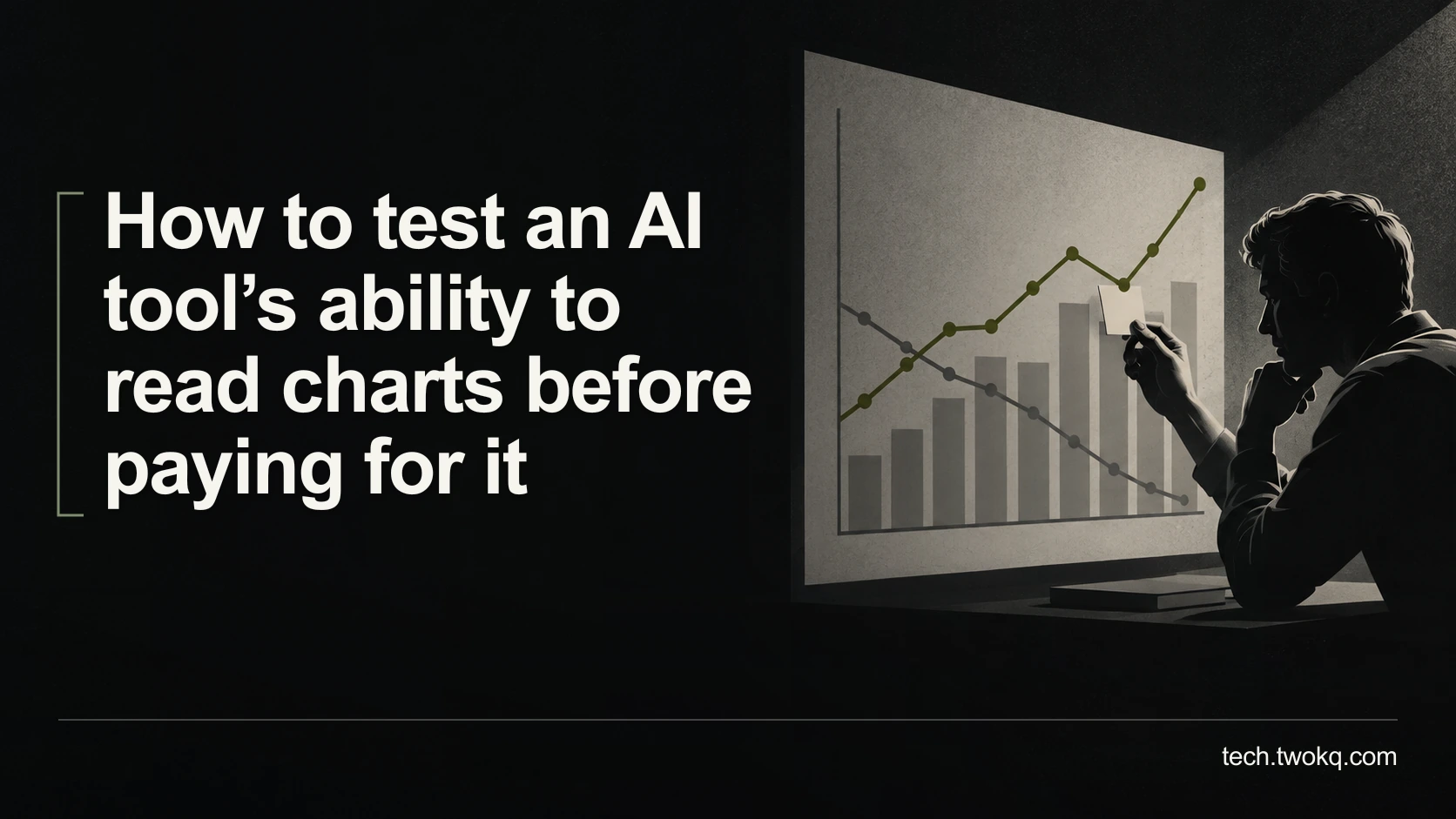
Test AI chart reading with known examples, checking axes, units, legends and uncertainty before paying for a tool or relying on its interpretation at work.
Direct answer: Test the exact application and account with charts whose underlying data you already know, then check axes, units, series labels and the resulting conclusion separately. Include difficult examples resembling your work, not only clear charts with obvious trends. Reject the tool for unattended interpretation if one recurring error can reverse a decision, even when most of its answers look correct.
A fluent description can conceal a basic visual mistake. An assistant may correctly identify the tallest bar while attaching it to the wrong group, or read a falling line as improvement when the measure describes something desirable.
The useful test therefore follows the meaning from the picture to the decision. The parent guide to choosing the right AI tool covers wider selection. This article uses the chart reading audit, an editorial evaluation method that keeps visual extraction, numerical interpretation and justified conclusions separate.
Applies to: chart-reading features in an AI application you can legitimately trial. The worked results are hypothetical; this article does not report testing any named model.
Define the chart task before selecting examples
Decide whether you need a description, an approximate value, an exact figure or an interpretation for a report. These are different requirements. A picture may support an approximate trend without containing enough visible precision for an exact numerical answer.
If you need exact values and an accessible data table exists, start with that table. My recommendation is to use AI image interpretation as an aid to reading charts, not as the preferred extraction route when the original numbers are available. It adds uncertainty you do not need.
Another choice is reasonable when the chart is the only available record or when image interpretation provides useful accessibility support. In that case, define which conclusions must remain provisional and who can inspect the evidence if the answer matters.
Write the required output before the trial: name the measure, explain the units, match each relevant series and state what can and cannot be concluded. This stops a product demonstration from substituting a more convenient task for yours.
Build a small reference set you understand
Use synthetic charts created from known data, or public examples whose source tables you can inspect. Preserve the underlying values and a short correct interpretation outside the AI conversation. Do not let the first model response become the answer key.
Include the chart types you actually encounter. A reader dealing with simple monthly bar charts does not need a test dominated by scientific contour plots. Include realistic complications, such as a truncated scale, closely coloured series, a missing observation or a footnote that changes the population.
Keep the number manageable enough that you can inspect every result. Twelve examples can support a useful first comparison, but this is an editorial working set, not a statistically validated benchmark. Its purpose is to reveal relevant failure modes before a purchase.
Use public or fictional content for an unapproved service. Charts can expose customer names, unpublished results or internal forecasts through titles and labels, even when they contain no obvious personal records.
Check what image the application actually receives
Preserve the complete chart, including title, axes, legend, units and relevant notes. Enlarging a small plot by cropping out its legend can make the bars easier to see while making the result impossible to interpret correctly.
Anthropic's vision documentation notes limitations involving image quality, small or rotated images and approximate spatial interpretation. It also explains that resizing can affect legibility. These are documented limitations, not a measured error rate for your chart.
Confirm whether your selected application reads the image itself or only text extracted from its enclosing document. Check supported file types and the account-specific feature. A PDF being accepted is not sufficient evidence that its charts were interpreted visually.
If the input is unclear, obtain a better authorised copy before judging the model. Record any preparation effort, because repeated cropping or exporting becomes part of the real workflow. Avoid enhancing an image in a way that invents detail absent from the source.
Run the chart reading audit
Ask the same bounded questions for each example. Start with what the chart shows, then move to what the numbers imply. Request uncertainty where a value cannot be read accurately rather than forcing a precise answer.
| Audit area | What you verify | Failure that changes the decision |
|---|---|---|
| Axes | Direction, scale, interval and zero point | A reversed or compressed scale changes the apparent relationship |
| Units | Currency, percentage, count and time period | A monthly value is treated as an annual total |
| Series | Legend, colour, group and missing observations | A result is attributed to the wrong population |
| Interpretation | Trend, comparison and limits of evidence | Correlation becomes a causal claim or uncertainty disappears |
Check the answer against the original image and your reference data. If the assistant reports a number, identify whether it is read from a label, estimated from the axis or calculated. Each route needs a different check.
For calculated values, reproduce the arithmetic independently. For estimates, assess whether the precision is justified by the display. A line positioned between labelled ticks does not normally establish several decimal places simply because the response supplies them.
For interpretation, ask whether the conclusion survives the chart's qualification. A confidence interval, which shows uncertainty around an estimate, is not decoration. If you do not understand its meaning in that study, consult the methods or a suitably knowledgeable person before asking the model to settle it.
Separate minor defects from disqualifying mistakes
Record errors by type rather than awarding one overall impression score. A misspelt label, an omitted caveat and a reversed axis do not have equal consequences. Identify the error types that make your intended output unusable before examining which tool performs better.
My working rule is to reject automatic use when the trial includes an unexplained mistake that reverses the comparison you would act on. That does not mean the tool can never assist. You may retain it for generating questions or an initial description subject to explicit checks.
Do not repair each difficult input until it becomes an easy demonstration and then report the final result as ordinary performance. Keep the preparation and failed attempts visible. A tool that succeeds only after extensive guidance may offer little advantage over reading the chart yourself.
Interpret a 48-field example honestly
Suppose a researcher tests 12 synthetic charts and checks four material fields in each: axis meaning, units, series identity and conclusion. That creates 12 × 4 = 48 checks. All results in this example are illustrative assumptions, not observed model performance.
Imagine that 45 checks pass and three fail. The simple pass proportion is 45 ÷ 48 × 100 = 93.75%. The failures are one unit mismatch, one incorrect legend assignment and one reversed-axis interpretation.
Calling that “93.75% accurate” would conceal the problem. If the reversed axis makes an apparent increase into a decrease, a single failure can overturn the report's recommendation. The other 45 correct checks do not repair that consequence.
Also count affected charts. If the three failures occur in three different charts, 3 ÷ 12 = 25% of the trial charts contain at least one material problem. If they occur together, only one chart is affected. Neither percentage predicts performance on the next document; they describe different properties of this constructed set.
The purchasing decision follows the failure pattern and review burden. Record the time needed to detect and correct each issue, and whether a non-specialist reviewer could realistically do so. A low subscription price cannot compensate for an error you cannot recognise.
Make a decision before the trial ends
- Spend 30 minutes selecting known examples and writing the reference answers. Include the difficult conditions your work actually contains.
- In one focused session, submit the same questions to the candidate tool and inspect every response. Keep the original inputs and failures.
- Before any trial renewal, review the disqualifying errors, preparation time and checks still required. Verify the paid account's relevant capability rather than assuming it matches the trial.
- Choose assisted use, a narrower role or rejection. If essential values remain unreadable or interpretation depends on expertise you lack, obtain the data or qualified help instead.
Related guides
Frequently asked questions
Is a tool that reads a simple bar chart ready for research papers?
No. A simple chart establishes only that the application handled that example under those conditions. Research figures may combine multiple panels, unfamiliar scales, error bars and qualifications in captions or methods. Select examples representing those actual features and verify the interpretation against the paper and underlying data where available. Do not generalise a successful demonstration into expertise across chart types. If you only need simple charts, a narrow successful trial may be enough for assisted use. The evaluation should match the work, not the most impressive or difficult figure you can find.
Should I remove the title so the model cannot guess the answer?
You can use an altered synthetic example to investigate whether the title is driving the response, but keep the normal complete chart in the main trial. Titles and captions legitimately provide context. The problem is a response that repeats their implication while failing to read contradictory values or conditions. Compare a clearly labelled synthetic variation with known data if that concern matters. Do not alter a real published chart and then circulate the result without explaining the change. Diagnostic manipulation belongs in your evaluation record, not in the evidence used for the final report.
Can I trust exact values extracted from an unlabelled line chart?
Only to the precision the original display supports. If the line falls between widely spaced ticks, its position may justify an estimate rather than an exact value. Ask the tool to label estimates and check them visually. Look for the source table or contact the author when exact numbers matter. A generated decimal is not additional evidence. For a rough comparison, a carefully qualified estimate may be sufficient; for calculations that determine a payment, threshold or substantive conclusion, obtain the underlying values instead of treating image interpretation as a replacement measurement instrument.
Should I compare two tools using different image formats?
Start with equivalent readable inputs and record any unavoidable difference. If one application requires an export or supports a different format, include that preparation in the comparison and confirm that no labels or notes were lost. You can then run a separate practical comparison using each tool's recommended route, but describe the distinction. Otherwise you may attribute a poor-quality screenshot to the model when the other tool received a clean original. The decision should reflect both interpretation and the effort of providing suitable material, not hide those differences behind a single score.
Does correct arithmetic mean the chart interpretation is sound?
No. The calculation can be correct while using the wrong series, units or population. Check the meaning of each input before checking the mathematical operation. For example, two percentages with different denominators cannot automatically be combined as though they described the same group. Read the legend, axis labels and relevant notes together. If the chart does not supply the information needed for your calculation, say so rather than filling the gap with an assumption. Arithmetic verification is one part of the audit; it does not establish that the quantities answer your actual question.
Can AI chart reading help someone with a visual impairment?
It may provide a useful description, but its reliability must be assessed against the user's task and available alternatives. Look first for an accessible data table, accompanying text or an author-provided description that preserves the chart's meaning. If AI assistance is used, distinguish a provisional description from verified evidence and establish a practical route for checking consequential details. Do not assume the user can perform the same visual verification described for a sighted reviewer. A suitable accessible workflow may involve source data, compatible assistive technology or another authorised person checking the specific uncertainty.
Sources and verification
- Anthropic: Vision documentation, checked 11 September 2026 for image-quality, resizing and interpretation limitations. No product was benchmarked.
- The chart reading audit and all 48-field results are editorial examples. The parent was read in supplied project content; its specified public URL could not be retrieved, so supplied internal paths are retained.
This article is practical guidance. Apply it in proportion to your tools, evidence, risks, and responsibilities.